People hate popups.
And that shouldn’t come as a surprise to the marketer in us because deep down, we hate popups too.
We absolutely detest annoying popups — ones that are generic, misleading, and intrusive. Poorly done popups can damage the user experience, making your visitors reach the close button (if they can find it) and never look back.
So, if popups are that bad, why do marketers keep using them? The average popup conversion rate is 11.09%, so if you get 5000 visitors on your website, you will get 550 new subscribers in a month.
Not bad, right?
The trick to popups — doing it right. And in this article, I will talk about all the things you should avoid to make your popups less intrusive and more popping.

8 Mistakes to Avoid in Your Next Email Popup
If your goal is to get more subscribers directly from your website, an email popup can do the trick. I have covered eight mistakes to avoid (along with some expert opinions from fellow marketers). Let’s get popping!
1. Irrelevant Offer
If the offer your popup presents is irrelevant or untimely, no amount of design or copy will fix it. You have to make sure your popup offer is connected to the user’s search intent and behavior on that page.
Here are some ideas you can offer people in your email popup to convert them:
- A discount or coupon. One of the top reasons people leave before buying is because they think the price is too hefty. An excellent way to combat this is by offering them a discount, coupon code, or offer.
- Free content. You can offer your visitors your newest ebook. Make sure that the lead magnet you are offering is relevant by matching it to the content on the page they are visiting.
Giving your audience a relevant offer based on their behavior is important to convert them. For your visitors in more advanced funnel stages, you can push your sales offers like free shipping, discounts, coupon codes, etc. For early-stage visitors who are just browsing and interested in educational content, popups with offers of eBooks or other lead magnets can be helpful.
Since we are on the topic of irrelevant offers, one thing that I have seen on websites is multiple offers popping from left, right, and center. This not only looks incredibly spammy but also overwhelms the visitor and doesnt direct them to take a single action.
According to Rebekah Edwards, co-founder of Clara Agency, “When interstitials overlay one another, your user sees an ad at the bottom of the page, a banner coming down from the top, then a popup asking for email signup, which looks incredibly spammy. Add one CTA at a time to drive conversions.”
2. Annoying Call-to-Action Buttons
Your audience doesn’t want to feel bad about themselves when they are on your site. Yet I have seen many examples of condescending CTA buttons on popups that do more harm than good.
The main idea behind these types of CTA buttons is to make the opt-out unappealing so visitors will opt for the other option. Let’s have a look at this popup:

The opt-in button focuses on the benefit (save your time) they provide to their customers and reads “Get My 20% Off”. On the other hand, the opt-out button has “No thanks. I’ll rather pay full price,” which sends a negative message to the user.
The psychology behind popups is that you want to incite an emotion of excitement and longing in your audience, so they feel compelled to opt-in and take up on your offer. When you use CTA language that’s either condescending or makes them feel like an idiot for opting out, you might lose them forever.
If a visitor doesn’t want to take up on your offer right now, there can be a myriad of reasons behind it. Maybe they are not interested in the offer at the time. Maybe they don’t have time or aren’t ready to take action. So write your CTAs without sounding irritating and be more welcome and accepting of your visitors no matter if they convert or not. Have a look at this simple popup from Huda Beauty. Their opt-out button has a simple and polite “No Thanks,” so the visitors don’t feel bad or annoyed if they want to opt out.

3. Bad Timing
While your popup content and CTA have a huge impact on the conversion rate, another important factor is when and where you show your popups.
It happens to me so many times when I am looking at a product, and an annoying popup will show up on my screen telling me to check out alternative products while I haven’t had the time to look at the product I was already considering.
Intrusive and untimely popups do more harm than good. To prevent this common mistake, you can use different triggers on different pages to decide when your visitor will see the popup.

According to Teodora Ema Pirciu, a content marketing strategist, the pop-up shouldn’t be the first thing you see when you enter a page. She says, “I see blogs where you’re invited to like a Facebook page or subscribe to a newsletter before you can even read the blog post’s title. It’s frustrating and counterproductive.”
For example, if you have a popup on pages with longer content like blog posts or product listing pages, you can use a scroll trigger to set it to show the popup after a visitor scrolls about 35 to 50% of the page. According to research, the first 10 seconds on a website are crucial — if a visitor stays longer than 10 seconds, odds are they’ll stick around for a while to read and explore the page.
Kristina Dinabourgski, B2C Content Marketer, says, “Don’t have the pop-up appear immediately when the user goes onto the page. Either set a delay or trigger it when the user is about to exit or when they scroll to the bottom.”
You can also trigger your popup to show on the checkout pages if the visitor is heading to the exit button. Show them that they get free shipping or 10% off, and they have a higher rate of sticking around.
Adding scroll triggers and optimizing them based on the visitor behavior will make sure you aren’t interrupting their browsing experience.
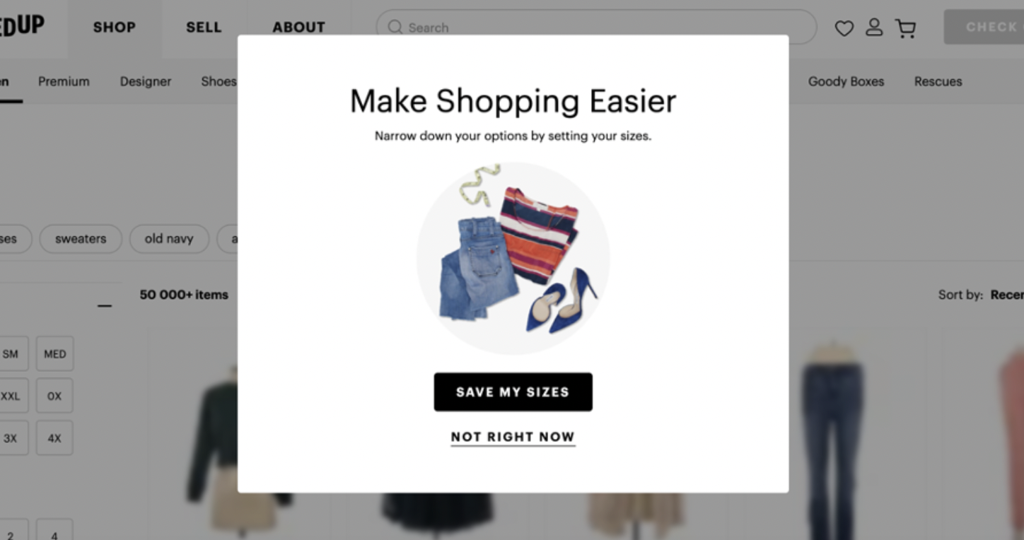
4. Too Many Input Fields
Who has the time and energy to fill in more than two input fields?
Because not me!
And this is a challenge a lot of online marketers face — you want to learn more about your customers to personalize their experience, and you add more questions to the popups. But this is where the problem begins. According to data, popups with more than two input fields show a lesser conversion rate.
When visitors see a lengthy opt-in form, they are running for the hills. And you lose an opportunity which might have been interested in your offer. Check out this popup that only has an option to enter their email to opt-in:
If you cant survive with just an email, you can ask your questions in multiple steps. Using this approach, you can collect rich lead data without hurting your conversions. Check out this example from Joyous Health, where they collect emails in one step and other information in the second step.

If you are in eCommerce, you can use the second step to get more information on your audience, their demographics, behavior, and interests so you can send personalized content to them without hurting the user experience.

5. Impossible Close Buttons
Is it just me spending embarrassingly long to find that small X to close an annoying popup?
Many popups have tiny, invisible, hard-to-click Xs that frustrate visitors and even cause them to leave for good. Some marketers completely remove the close button, hoping that the visitors will figure it out themselves.

If you don’t have a clear and clickable close button on your popup, it ruins the user experience for many. Check out this popup with a clear close button that’s visible and big enough that users on their mobile devices can easily touch it to close it.

Remember, if visitors can’t close your popups, they’ll most likely close the whole tab and move on to another website. Kenza Moller, a Content Marketer, says, “Don’t make it difficult to close the pop-ups. I will rage-close any website that makes it intentionally difficult to close out of a pop-up unless you sign up/click the CTA.”
6. Not Optimizing for Mobile
The average desktop popup conversion rate is 9.69%, while mobile popups convert at 11.07%.
That’s a huge difference and something you don’t want to ignore.
To make the most out of your mobile audience, you need to optimize your popups, so they are easy to read and don’t annoy your audience.

To mobile-optimize your email popup, here are a few things to keep in mind:
- Write concise copy so people can easily read it.
- Have a clear goal with a design that immediately attracts your visitors. The CTA should be an action-oriented prompt for what you want your customers to do.
- Limit the information you are asking for. On mobile, you have lesser space, so you might want to stick with only an email input field.
- Don’t take up the whole screen, so visitors don’t feel overwhelmed.
7. Triggering the Popup Despite Opting In
If you have opted in for an offer — subscribed to the newsletter, got that 10% off on your first offer, availed of the free shipping — and you still get the same popup again, that’s got to be annoying.
Surprisingly, that’s quite common.
Set your triggers for popups to exclude the audience who has already opted in. Repeatedly showing them the same popup can become intrusive and annoying. You can trigger the following popup for new visitors:

And then for returning customers, you can trigger a popup to welcome them and show them new offers or products that have arrived ever since they visited the website.

8. Not A/B Testing Your Popup
One of the biggest mistakes you can make as a marketer is not A/B testing your email popups. If you don’t test it, you won’t know what your audience likes and gravitates towards.
A/B testing your popup means changing one element of your popup and testing these variations to see which performs better and then going ahead with it.
Here are some of the elements you can A/B test on your popup:
- Headline: Change the content. Maybe change the whole headline or just one or two words. An example of this is to replace “Get 10% Off Your First Order” with “Want an Extra 10% Off Your Purchase”.
- Input fields: You can experiment with what works best for your audience. You can also play around with making fields mandatory or not.
- CTA button: Test both the design and the content. Also, test the color of the CTA button and see which stands out.
- Images: Test if people opt for the popup with a picture or without a picture. You can also test two different image ideas and see which one converts better.
- Timing: Timing is a crucial element to perfect. Set different timings for your popups to appear to see when your visitors are most likely to opt-in and claim the offer.
- Triggers: You can also A/B test the different triggers you set for a popup to show up — when visitors head for the exit button, when they abandon their cart, when they are halfway through the blog, etc.
With A/B testing your popup variations, you will see quite a difference in their conversion and click-through rates. Creating a perfect pop-up that shows up at the right place, at the right time, and has all the right words takes time and lots of testing. The best way to get there is to constantly track your visitors’ behavior and engagement and fine-tune your pop-ups according to the results.
Start Your Popup Marketing Right!
Popups are hard to figure out. You want to make sure your popups are not intrusive and annoying while having the perfect offer that compels your visitors to sign up.
If you feel like this whole email popup business is a lot of work and want to sit back while someone does all the heavy lifting for you, contact us. You can relax while we take care of all your popups, from ideation and strategy to execution and analytics.